You're in! Please check your inbox.
Oops! Please try again.
|

| IN TODAY'S ISSUE |
|
|
|
WHAT'S NEW | 01 |
Design With Purpose |
In today’s issue, we’re looking at how designers are creating work that goes beyond just function. Across branding, typography, motion, and tooling, these stories reveal a shared drive to make design more responsive, more human, and more meaningful.
From fonts that solve real accessibility gaps to identity systems that evoke place, memory, and emotion, each piece shows what happens when design meets intention.
What ties it all together? A commitment to design that moves beyond the surface — toward clarity, impact, and deeper connection. Let’s get into it.
INSPIRATION | 02 |

@concept_central
 @ralabs_ |  @writenicecode |
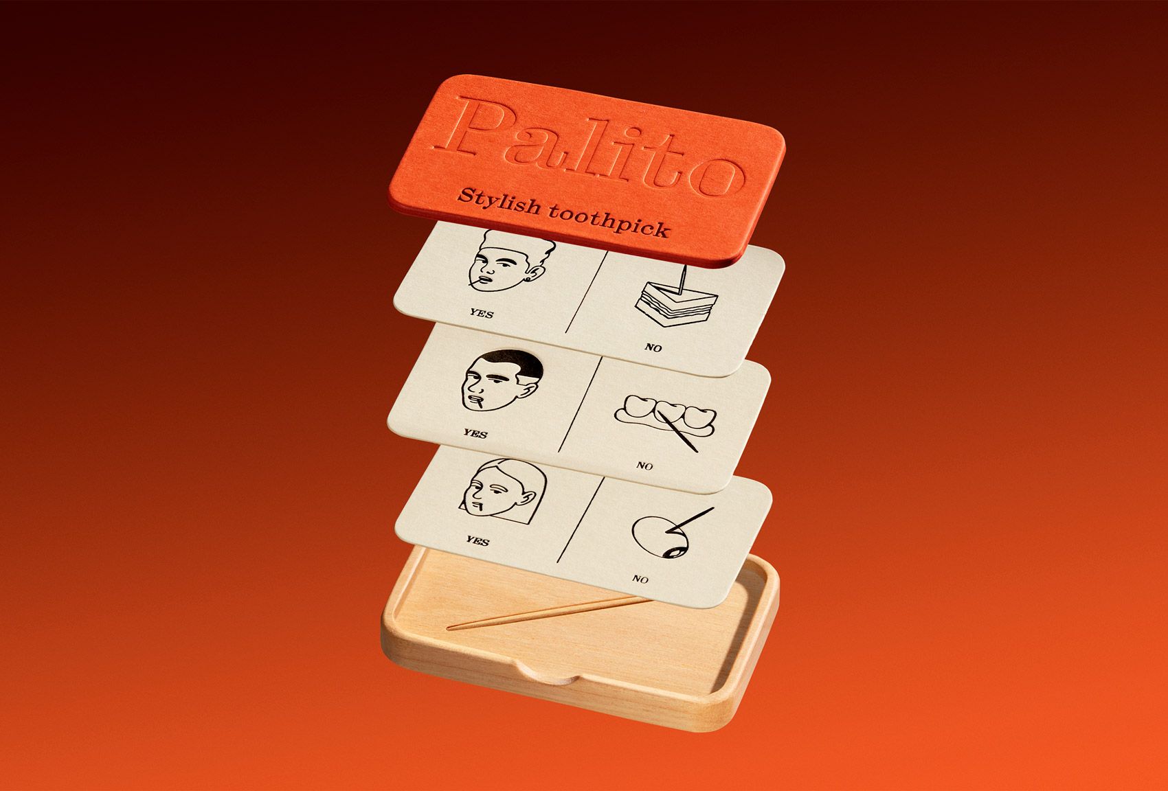
Palito
Classmate
 @wladuiux |  @Metagravity0 |
Metric
Metric
@wegrow_design
Sponsored |

No simulations or reference files—use the real materials that tap directly into Apple’s APIs.
See how your app will look, feel, and function ahead the iOS 26 launch later this year.
IN THE NEWS | 03 |

Jodie Chung’s graduate work is a reminder of what design school can still offer. Fresh perspective, cultural awareness, and bold visual execution. If you’re craving new voices and original thinking, this one’s worth a look.
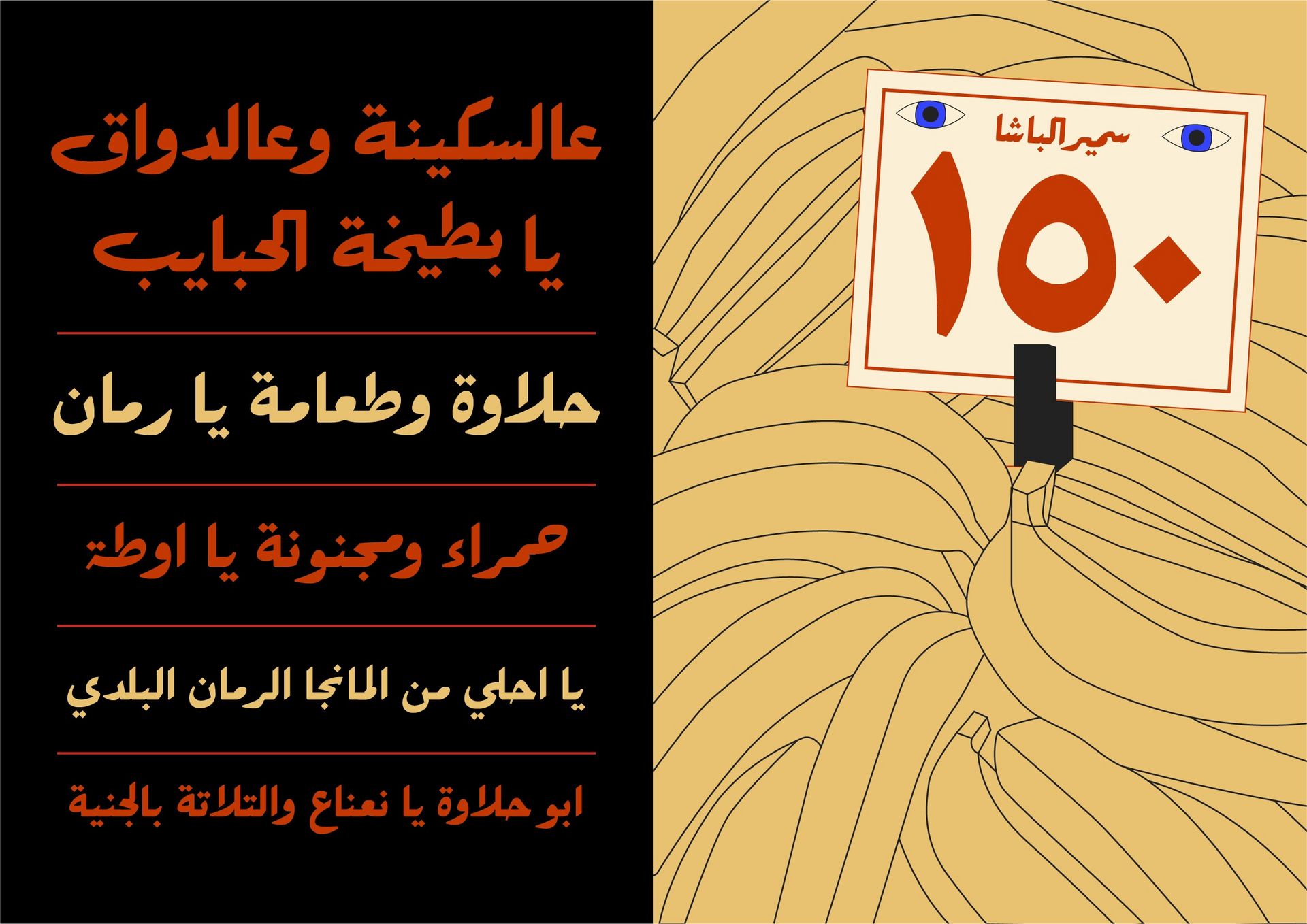
A new font inspired by Egyptian street culture and traditional Ruqʿah scripts offers something Arabic designers rarely get: horizontal typesetting that actually works. It’s a beautifully functional fix to a long-ignored problem.

One designer shares how letting go of award shows led to work that made real impact in neighborhoods, not just juries. It’s a sharp reminder that recognition means little if the work isn’t resonating where it matters.
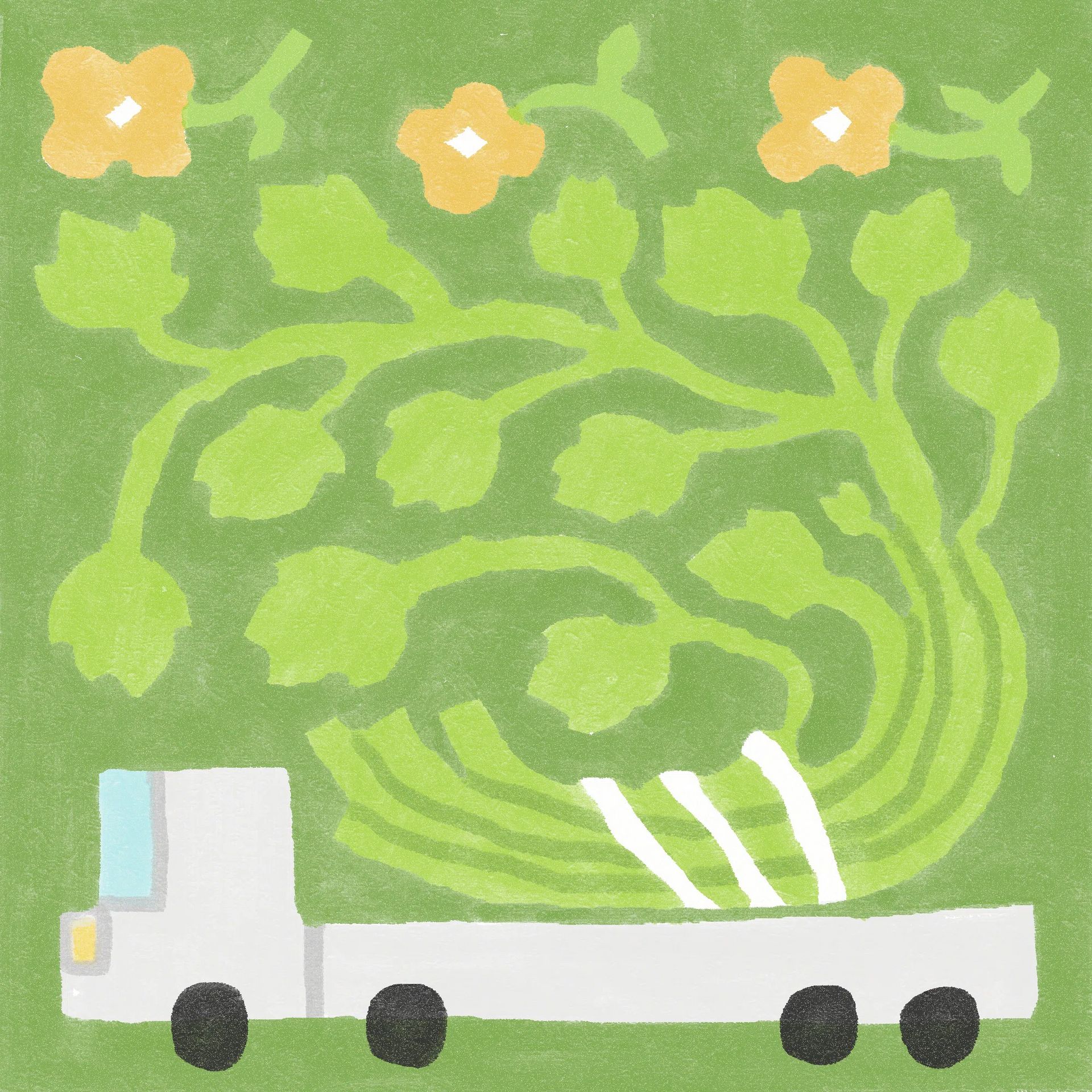
Yo Li’s illustrations pair delicate color with warped, uncanny figures. They pull you into scenes that feel soft at first glance but linger with something stranger underneath. It’s sweet, surreal tension done right.
Branded templates don’t have to fall apart when handed off. This guide lays out simple, smart tips to create templates that stay on-brand, editable, and frustration-free for teams and clients alike.
AI isn’t taking over the studio — it’s just sharpening the tools. Here’s how one team integrates it without losing their voice, showing what it looks like to stay curious and in control.
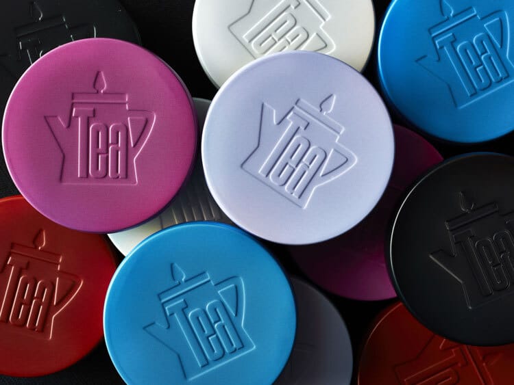
This tea brand uses packaging to evoke nostalgia and place. Wrapping bold storytelling in soft, editorial design. Proof that food and drink branding doesn’t need to shout to be expressive.


